CMS GUIDE
Table of Contents
Style Management
The following labels refer to styling options/classes in the "STYLE" dropdown menu located in the toolbar in every Custom HTML Module's content editor:
-
Heading Text:
Headline 1
Headline 2
Headline 3
-
Body Text:
Paragraph 1 - Lorem ipsum dolor sit amet, consectetur adipiscing elit, sed do eiusmod tempor incididunt ut labore et dolore magna aliqua. Ut enim ad minim veniam, quis nostrud exercitation ullamco laboris nisi ut aliquip ex ea commodo consequat.
Paragraph 2 - Lorem ipsum dolor sit amet, consectetur adipiscing elit, sed do eiusmod tempor incididunt ut labore et dolore magna aliqua. Ut enim ad minim veniam, quis nostrud exercitation ullamco laboris nisi ut aliquip ex ea commodo consequat.
-
Links:
Link Default
Link Arrow
-
Buttons:
Button PrimaryButton SecondaryButton TertiaryButton Orange -
Spacing:
Lorem ipsum dolor sit amet.
↑ Margin Top 10px
Lorem ipsum dolor sit amet.
↑ Margin Top 20px
Lorem ipsum dolor sit amet.
↑ Margin Top 30px
Page Templates
What page templates are available to create new pages with?
The following page templates are available in the "CMS Primary Theme" theme:
In which theme should I create my page? / Which theme should my page be assigned to?
To use one of the page templates, you must create your page inside the theme where the desired page template resides. You may later assign the page to another theme if needed.
See General Advice & FAQs for more details.
What if I don't need all the sections used in a template?
Before using a CMS page template to create a page, determine if you’re going to need all the sections used in that template. Then, after using the template to create a new page, remove the sections from the page which aren’t needed BEFORE SAVING THE NEW PAGE. This prevents those sections from ever being created and we avoid cluttering the system with unused sections and modules.
Can I create a CMS page without using one of the CMS Page Templates?
Custom HTML Modules: Content Editor (WYSIWYG) FAQs
How do I replace placeholder ("lorem ipsum") or unwanted text content?
The content editor can be finicky. To replace placeholder or unwanted text, we recommend that you first click the “BLOCKS” button in the toolbar to reveal outlines surrounding block-level elements. Then, select the text you wish to replace and type in your desired text. Or, you can place your cursor at the end of the text you want to replace, add your desired text, and then select and delete the placeholder text preceding it. We do NOT recommend selecting all placeholder text in the editor and deleting it before you add your desired content. As a result you may accidentally erase necessary markup that the content depends on. It is always best to edit text elements one at a time rather than deleting everything you don’t want from the start.
Can I copy/paste from other sources?
Be very careful when copy/pasting text content from other sources into a Custom HTML module's content editor. When copying from an external document, take steps to ensure the text you are copying is plain text (as opposed to rich text.) When copying from a web page, make sure you are ONLY including text and not actual HTML tags (<p>, <br>, etc.) as this could result in unintended styling/format inconsistencies.
How do I change the appearance of text content (color, font size, etc)?
The "STYLE" dropdown in the toolbar can be used to edit the styling/appearance of content. Keep in mind that when you add a style from the dropdown, it does not overwrite other styles previously applied to the element. This allows greater flexibility in cases where you may need more than one style applied, but you will need to remember to uncheck undesired styles after applying them.
Please refer to Style Management for examples of classes/styles you may apply.
Keep in mind that changing the appearance or styles of text should be done SPARINGLY - for the sake of consistency across pages, it is best to stick with the module's default styling whenever possible.
How do I add/edit a link?
The "insert/edit link" button in the toolbar is used to create and modify links:
To create a new link, type your desired link text within the content editor, select it, and then click the "insert/edit link" button. This may be tricky if you're creating a new link next to an already-existing link. To do this, place your cursor at the end of the existing link's text and then press the right arrow key, so your cursor is outside the existing link. Then, type the new link's text, select it and click the "insert/edit link" button.
To modify an existing link, click into the middle of the link text within the content editor, then click the "insert/edit link" button.
Note: Using proper link text is very important. For more details, see "Does it matter what I use for [clickable] link text?" in General Advice & FAQs.
How do I add/edit an image?
The "asset picker" button in the toolbar allows you to add images into the content editor. To modify an existing asset, click the asset and then click the "asset picker" button. Not all custom HTML modules were made with the intent to have an image placed in them. (Tip: If your default placeholder content did not contain an image, you should probably avoid adding one with this tool.)
Note: If you're including an image in a Custom HTML module, remember to consider the image alt text (which is editable through the "asset picker" button), and include a value when necessary. For more details, see "Do I need to update/include alt text for every image?" in General Advice & FAQs.
How do I add a code snippet?
The "insert code snippet" button in the toolbar adds pre-made snippets of code into the content editor. Note that code snippets are often (but not always) used as a way to revert either the entire content of a Custom HTML Module to its default state, or to revert a part of its content to its original state. In many cases you will not need to use code snippets unless you're attempting to "fix" a module (i.e. bring back original content which was since removed.)
Additionally, code snippets are used as a way to add specific html into your content editor that is either difficult or impossible to achieve without editing the actual source code.
IMPORTANT: Be very careful to only use code snippets that are intended for use in the specific module you’re editing. In most cases the name of the code snippet should partially or exactly match the name of the module you’re editing. A list of all code snippets that are intended for use within a module will appear in that module's parent section's documentation in the Section Guide. Do not use a code snippet when the section name in the title of the code snippet does not match the section you are currently editing. For example, if you're editing a section created from a section template labeled as "Section 1" you should only be using code snippets whose titles include "Section 1."
I've messed up my edits and would like to revert to the original "lorem ipsum" placeholder content. Is there a way to do that?
Check to see if the module you're editing has a default code snippet available. The name of the snippet should match the name of your module (minus the given section name prefix.) If so, you may delete the entire content and then insert the appropriate code snippet. Some modules don't have default code snippets available, but they may have other snippets which could replace specific portions of your content.
Does it matter which levels of headings (H1, H2, etc) I use in my content?
Yes. For SEO and accessibility purposes, it is important that your page’s heading structure is hierarchical. This means that your page’s top heading needs to be an h1 heading.
You should also be careful to avoid skipping heading levels (i.e. using an h3 heading before an h2 has been used, etc.) If you need to change the appearance of a heading without changing the level, apply one of the heading classes from the content editor's "STYLE" dropdown (see Style Management for a list of these heading style classes.)
General Advice & FAQs
How can I ensure that my content will be accessible to all users?
Be sure to follow all recommendations and instructions given in this guide, particularly the recommendations involving link text, image alt text, and heading levels. To learn more about accessibility, please see Accessibility for Radancy CMS Publishers.
Can I change the layout assignment of a page/section/module?
You should never change a layout assignment unless specifically instructed to do so in the relevant section's documentation found in the Section Guide. This will almost always lead to unintended results.
Can I add a module to a section?
You should never add a module to a section unless specifically instructed to do so in the relevant section's documentation found in the Section Guide. This will almost always lead to unintended results.
When I'm adding a section from the "Add New" section menu to a page, what should I name my new section?
To avoid future confusion, especially for other CMS users who may need to edit/update the content you're creating, naming conventions should be consistent throughout the site. When creating a section that you anticipate will only be used on the page you're adding it to, we recommend the following naming convention: [Page Name OR Abbreviated Page Name] - [Section Template Name] [Number (only include if you anticipate other sections of the same template will be added to the same page.)] For example, "Benefits - Full Width Copy" or "DEI - Full Width Copy 1." If you anticipate that the section you're creating may be used on other pages as well, we suggest giving it a name that summarizes its purpose/intent rather than its content or context (which may change or be updated later.) For example, "Human Resources Job List" or "Annual Job Fair CTA."
Note: While you CAN change a section's name after creating it, you will NOT be able to change the names of the modules included in the section (which will, by default, include the ORIGINAL section name.) So we recommend that you carefully choose a good name for each section you create.
Can I create a CMS page without using one of the CMS Page Templates?
Yes, but this is not recommended as creating a page without using a CMS Page Template will require you to select a page layout. To avoid selecting the incorrect layout, we recommend using one of the available CMS Page Templates, in all cases.
If you are looking to create a "blank" page, see the next question.
How do I create a "blank" page?
To create a blank page, click the "Add Page" button in the "CMS Primary Theme" theme and select the [TEMPLATE NAME] page template.
Which theme should my page be assigned to?
All CMS pages should be assigned to the "CMS Primary Theme" theme.
DO NOT assign any CMS pages to the "Default Theme (GST)" theme. This theme is enabled for CMS due to system requirements, but it is NOT intended to be used as a theme for CMS Pages.
Do I need to update/include alt text for every image?
Every time you add or replace an image file, you should consider whether to include alt text for the image. In some cases, such as when the image is considered descriptive and not essential to the page content, alt text may be left blank. For more details, please see this alt text decision tree. Not only are these considerations essential in making the site accessible to non-visual users, it will also improve SEO.
Does it matter what I use for [clickable] link text?
It matters a lot. To make links accessible to all users, use link text that would make sense to users if taken out of the surrounding context. For example, "learn more about our benefits" is acceptable, whereas "click here" or "learn more" are not. This is important in all situations but be particularly careful when adding/editing links inside Custom HTML modules, as you'll have full control over what text is included in a link.
How do I update/add a hero banner to my page?
[INCLUDE HERO BANNER INSTRUCTIONS HERE]
CMS User Notes
How can I add to or update the notes to this section?
Find this section ("CMS Guide - CMS User Notes") in your section list and edit its "CMS Guide - CMS User Notes-Section 1 - Copy" Custom HTML Module to add as many notes as you'd like right here. Be careful to not delete this instructional text, so that it may be referenced later on.
Add your notes below:
Section Guide
Important! Before using a section from this guide, please read the corresponding documentation for that section. Documentation is found above each section in this guide.
Note that section titles are color coded based on which menu they can be found in after clicking the "add section" button on any page:
Red - find this section in the "Use Existing" Menu.
Green - find this section in the "Add New" Menu.
Keep in mind that when you edit a section from the "Use Existing" Menu, you are editing every instance of that section. Sections added via the "Add New" Menu are safe to be edited freely, as a new instance of the section is created every time it's added to a page.
Large Light Blue Hero Banner Media Right and Copy Left (Section 42a)
Suggested Use: Large banner at the top of the page, just below the Search Form - (Section 4b)
Available Code Snippets:
- v3 - Section 42 - Copy: Use as a "reset" for any "Section 42 - Copy" Module.

Header Lorem Ipsum
Dolor Sit Amet
Lorem ipsum dolor sit amet, consectetur adipiscing elit.
Large Light Blue Hero Banner Video Right and Copy Left (Section 42b)
Suggested Use: Large banner at the top of the page, just below the Search Form - (Section 4b)
Available Code Snippets:
- v3 - Section 42 - Copy: Use as a "reset" for any "Section 42 - Copy" Module.
Header Lorem Ipsum
Dolor Sit Amet
Lorem ipsum dolor sit amet, consectetur adipiscing elit.
Large Blue Hero Banner Media Right and Copy Left - (Section 42c)
Suggested Use: Large banner at the top of the page, just below the Search Form - (Section 4b)
Available Code Snippets:
- v3 - Section 42 - Copy: Use as a "reset" for any "Section 42 - Copy" Module.
Header Lorem Ipsum
Dolor Sit Amet
Lorem ipsum dolor sit amet, consectetur adipiscing elit.
Large Blue Hero Banner Video Right and Copy Left - (Section 42d)
Suggested Use: Large banner at the top of the page, just below the Search Form - (Section 4b)
Available Code Snippets:
- v3 - Section 42 - Copy: Use as a "reset" for any "Section 42 - Copy" Module.
Header Lorem Ipsum
Dolor Sit Amet
Lorem ipsum dolor sit amet, consectetur adipiscing elit.
Blue Hero Banner with Text Copy Only - (Section 42e)
Suggested Use: Large banner at the top of the page, just below the Search Form - (Section 4b)
Available Code Snippets:
- v3 - Section 42 - Copy: Use as a "reset" for any "Section 42 - Copy" Module.
Header Lorem Ipsum
Dolor Sit Amet
Lorem ipsum dolor sit amet, consectetur adipiscing elit.
Full Width Hero Banner Transparent - (Section 42f)
Suggested Use: Large banner at the top of the page, just below the Search Form - (Section 4b)
Available Code Snippets:
- v3 - Section 42 - Copy: Use as a "reset" for any "Section 42 - Copy" Module.

Header Lorem Ipsum
Dolor Sit Amet
Lorem ipsum dolor sit amet, consectetur adipiscing elit.
BD Blue Banner Text Only - (Section 49a)
Suggested Use:Generic banner with a small amount of text.
Available Code Snippets:
- v3 - Section 49 - Copy: Use as a "reset" for any "Section 49 - Copy" Module.
Lorem ipsum dolor sit
Full Width Headline and Copy Text Only- (Section 40a)
Suggested Use: General copy, page introductory copy, articles, longer copy, etc.
Available Code Snippets:
- v3 - Section 40 - Headline: Use as a "reset" for any "Section 40 - Headline" Module.
- v3 - Section 40 - Copy: Use as a "reset" for any "Section 40 - Copy" Module.
Lorem ipsum dolor sit amet, consectetur adipiscing elit commodo elit posuere.
Nullam id vestibulum lectus. Curabitur commodo posuere sapien, non vulputate lorem dapibus vitae. Fusce est ligula, tincidunt eget cursus vel, faucibus eget sem. Donec a mattis lectus. Praesent ac nulla iaculis, ornare magna quis, posuere ex. Quisque pulvinar feugiat sem in ultrices. Pellentesque ut volutpat nunc. Duis suscipit orci finibus libero bibendum, eget ornare mauris posuere. Curabitur sed lorem eu tortor convallis eleifend a eu ipsum. Morbi tempor, libero ac fringilla dignissim, ligbortis urna, commodo vehicula dolor libero.
Full Width Blue Headline and Copy - (Section 40b) Text Only
Suggested Use: General copy, page introductory copy, articles, longer copy, etc.
Notes: Same layout with a dark blue background.
Available Code Snippets:
- v3 - Section 40 - Headline: Use as a "reset" for any "Section 40 - Headline" Module.
- v3 - Section 40 - Copy: Use as a "reset" for any "Section 40 - Copy" Module.
Lorem ipsum dolor sit amet, consectetur adipiscing elit commodo elit posuere.
Nullam id vestibulum lectus. Curabitur commodo posuere sapien, non vulputate lorem dapibus vitae. Fusce est ligula, tincidunt eget cursus vel, faucibus eget sem. Donec a mattis lectus. Praesent ac nulla iaculis, ornare magna quis, posuere ex. Quisque pulvinar feugiat sem in ultrices. Pellentesque ut volutpat nunc. Duis suscipit orci finibus libero bibendum, eget ornare mauris posuere. Curabitur sed lorem eu tortor convallis eleifend a eu ipsum. Morbi tempor, libero ac fringilla dignissim, ligbortis urna, commodo vehicula dolor libero.
Text Copy Black on White - (Section 10d)
Suggested Use: General copy, shorter copy, etc.
Available Code Snippets:
- v3 - Section 10 - Copy: Use as a "reset" for any "Section 10 - Copy" Module.
Nullam id vestibulum lectus. Curabitur commodo posuere sapien, non vulputate lorem dapibus vitae. Fusce est ligula, tincidunt eget cursus vel, faucibus eget sem. Donec a mattis lectus. Praesent ac nulla iaculis, ornare magna quis, posuere ex. Quisque pulvinar feugiat sem in ultrices. Pellentesque ut volutpat nunc. Duis suscipit orci finibus libero bibendum, eget ornare mauris posuere.
Text Copy White on Blue - (Section 10e)
Suggested Use: General copy, shorter copy, etc.
Notes: Dark blue background.
Available Code Snippets:
- v3 - Section 10 - Copy: Use as a "reset" for any "Section 10 - Copy" Module.
Nullam id vestibulum lectus. Curabitur commodo posuere sapien, non vulputate lorem dapibus vitae. Fusce est ligula, tincidunt eget cursus vel, faucibus eget sem. Donec a mattis lectus. Praesent ac nulla iaculis, ornare magna quis, posuere ex. Quisque pulvinar feugiat sem in ultrices. Pellentesque ut volutpat nunc. Duis suscipit orci finibus libero bibendum, eget ornare mauris posuere.
Article Headline with Text Copy - (Section 10f)
Suggested Use: Article intro copy
Available Code Snippets:
- v3 - Section 10 - Article Intro: Use as a "reset" for any "Section 10 - Article Intro" Module.
Article Category
Lorem ipsum dolor sit amet, consectetur adipiscing elit commodo elit posuere.
Lorem ipsum dolor sit amet, consectetur adipiscing elit, sed do eiusmod tempor incididunt ut labore et dolore magna aliqua. Ut enim ad minim veniam, quis nostrud exercitation ullamco laboris nisi ut aliquip ex ea commodo consequat. Nullam id vestibulum lectus. Curabitur commodo posuere sapien, non vulputate lorem dapibus vitae. Fusce est ligula, tincidunt eget cursus vel, faucibus eget sem. Donec a mattis lectus. Donec a mattis lectus. Praesent ac nulla iaculis.
Lorem ipsum dolor sit amet, consectetur adipiscing elit, sed do eiusmod tempor incididunt ut labore et dolore magna aliqua. Ut enim ad minim veniam, quis nostrud exercitation ullamco laboris nisi ut aliquip ex ea commodo consequat. Nullam id vestibulum lectus. Curabitur commodo posuere sapien, non vulputate lorem dapibus vitae. Fusce est ligula, tincidunt eget cursus vel, faucibus eget sem. Donec a mattis lectus. Donec a mattis lectus. Praesent ac nulla iaculis. Lorem ipsum dolor sit amet, consectetur adipiscing elit, sed do eiusmod tempor incididunt ut labore et dolore magna aliqua. Ut enim ad minim veniam, quis nostrud exercitation ullamco laboris nisi ut aliquip ex ea commodo consequat. Nullam id vestibulum lectus. Curabitur commodo posuere sapien, non vulputate lorem dapibus vitae. Fusce est ligula, tincidunt eget cursus vel, faucibus eget sem. Donec a mattis lectus. Donec a mattis lectus. Praesent ac nulla iaculis.
Large Image Left and Copy Right- (Section 112b)
Suggested Use: Shorter copy facing a supporting image or video.
Notes: The recommended image size for the "Section 112 - Media" module is 768x614 If an image asset does not match the recommended aspect ratio, it will appear as "cropped" to fit the expected dimensions. To avoid this, and to ensure optimal image quality and performance, make sure the image asset matches the recommended size before using it.
Available Code Snippets:
- v3 - Section 112 - Copy - Primary Btn: Use as a "reset" for any "Section 112 - Content - Primary Btn" Module.

Heading CMS Editable Section
WNullam id vestibulum lectus. Curabitur commodo posuere sapien, non vulputate lorem dapibus vitae. Fusce est ligula, tincidunt eget cursus vel, faucibus eget sem. Donec a mattis lectus. Nullam id vestibulum lectus. Curabitur commodo posuere sapien, non vulputate lorem dapibus vitae. Fusce est ligula, tincidunt eget cursus vel, faucibus eget sem. Donec a mattis lectus. Nullam id vestibulum lectus. Curabitur commodo.
Large Image Right and Copy Left - (Section 112a)
Suggested Use: Shorter copy facing a supporting image or video.
Notes: The recommended image size for the "Section 112 - Media" module is 768x614 If an image asset does not match the recommended aspect ratio, it will appear as "cropped" to fit the expected dimensions. To avoid this, and to ensure optimal image quality and performance, make sure the image asset matches the recommended size before using it.
Available Code Snippets:
- v3 - Section 112 - Copy - Primary Btn: Use as a "reset" for any "Section 112 - Content - Primary Btn" Module.
Heading CMS Editable Section
WNullam id vestibulum lectus. Curabitur commodo posuere sapien, non vulputate lorem dapibus vitae. Fusce est ligula, tincidunt eget cursus vel, faucibus eget sem. Donec a mattis lectus. Nullam id vestibulum lectus. Curabitur commodo posuere sapien, non vulputate lorem dapibus vitae. Fusce est ligula, tincidunt eget cursus vel, faucibus eget sem. Donec a mattis lectus. Nullam id vestibulum lectus. Curabitur commodo.
Large Image Left and Copy Right - (Section 112d) Orange CTA
Suggested Use: Shorter copy facing a supporting image or video.
Notes: The recommended image size for the "Section 112 - Media" module is 768x614 If an image asset does not match the recommended aspect ratio, it will appear as "cropped" to fit the expected dimensions. To avoid this, and to ensure optimal image quality and performance, make sure the image asset matches the recommended size before using it.
Available Code Snippets:
- v3 - Section 112 - Copy - Orange Btn: Use as a "reset" for any "Section 112 - Content - Orange Btn" Module.
Heading CMS Editable Section
WNullam id vestibulum lectus. Curabitur commodo posuere sapien, non vulputate lorem dapibus vitae. Fusce est ligula, tincidunt eget cursus vel, faucibus eget sem. Donec a mattis lectus. Nullam id vestibulum lectus. Curabitur commodo posuere sapien, non vulputate lorem dapibus vitae. Fusce est ligula, tincidunt eget cursus vel, faucibus eget sem. Donec a mattis lectus. Nullam id vestibulum lectus. Curabitur commodo.
Large Image Right and Copy Left - (Section 112c) Orange CTA
Suggested Use: Shorter copy facing a supporting image or video.
Notes: The recommended image size for the "Section 112 - Media" module is 768x614 If an image asset does not match the recommended aspect ratio, it will appear as "cropped" to fit the expected dimensions. To avoid this, and to ensure optimal image quality and performance, make sure the image asset matches the recommended size before using it.
Available Code Snippets:
- v3 - Section 112 - Copy - Orange Btn: Use as a "reset" for any "Section 112 - Content - Orange Btn" Module.
Heading CMS Editable Section
WNullam id vestibulum lectus. Curabitur commodo posuere sapien, non vulputate lorem dapibus vitae. Fusce est ligula, tincidunt eget cursus vel, faucibus eget sem. Donec a mattis lectus. Nullam id vestibulum lectus. Curabitur commodo posuere sapien, non vulputate lorem dapibus vitae. Fusce est ligula, tincidunt eget cursus vel, faucibus eget sem. Donec a mattis lectus. Nullam id vestibulum lectus. Curabitur commodo.
Large Image Left and Copy Right - (Section 112f) Blue Background
Suggested Use: Shorter copy facing a supporting image or video.
Notes: The recommended image size for the "Section 112 - Media" module is 768x614 If an image asset does not match the recommended aspect ratio, it will appear as "cropped" to fit the expected dimensions. To avoid this, and to ensure optimal image quality and performance, make sure the image asset matches the recommended size before using it.
Available Code Snippets:
- v3 - Section 112 - Copy - Secondary Btn: Use as a "reset" for any "Section 112 - Content - Secondary Btn" Module.
Heading CMS Editable Section
WNullam id vestibulum lectus. Curabitur commodo posuere sapien, non vulputate lorem dapibus vitae. Fusce est ligula, tincidunt eget cursus vel, faucibus eget sem. Donec a mattis lectus. Nullam id vestibulum lectus. Curabitur commodo posuere sapien, non vulputate lorem dapibus vitae. Fusce est ligula, tincidunt eget cursus vel, faucibus eget sem. Donec a mattis lectus. Nullam id vestibulum lectus. Curabitur commodo.
Large Image Right and Copy Left - (Section 112e) Blue Background
Suggested Use: Shorter copy facing a supporting image or video.
Notes: The recommended image size for the "Section 112 - Media" module is 768x614 If an image asset does not match the recommended aspect ratio, it will appear as "cropped" to fit the expected dimensions. To avoid this, and to ensure optimal image quality and performance, make sure the image asset matches the recommended size before using it.
Available Code Snippets:
- v3 - Section 112 - Copy - Secondary Btn: Use as a "reset" for any "Section 112 - Content - Secondary Btn" Module.
Heading CMS Editable Section
WNullam id vestibulum lectus. Curabitur commodo posuere sapien, non vulputate lorem dapibus vitae. Fusce est ligula, tincidunt eget cursus vel, faucibus eget sem. Donec a mattis lectus. Nullam id vestibulum lectus. Curabitur commodo posuere sapien, non vulputate lorem dapibus vitae. Fusce est ligula, tincidunt eget cursus vel, faucibus eget sem. Donec a mattis lectus. Nullam id vestibulum lectus. Curabitur commodo.
Note To Developer: Please include documentation for this section!
Heading CMS Editable Section
WNullam id vestibulum lectus. Curabitur commodo posuere sapien, non vulputate lorem dapibus vitae. Fusce est ligula, tincidunt eget cursus vel, faucibus eget sem. Donec a mattis lectus. Nullam id vestibulum lectus. Curabitur commodo posuere sapien, non vulputate lorem dapibus vitae. Fusce est ligula, tincidunt eget cursus vel, faucibus eget sem. Donec a mattis lectus. Nullam id vestibulum lectus. Curabitur commodo.
Video - (Section 43a)
Available Code Snippets:
- v3 - Section 43 - Copy: Use as a "reset" for any "Section 43 - Copy" Module.
Lorem Ipsum Dolor
Lorem ipsum dolor sit amet, consectetur adipiscing elit. Aenean sit amet turpis vitae turpis euismod facilisis in sed quam. Ut sed nunc ac nisi tristique facilisis.
Intro Copy with Large Video on Blue Background- (Section 43b)
Available Code Snippets:
- v3 - Section 43 - Copy: Use as a "reset" for any "Section 43 - Copy" Module.
Lorem Ipsum Dolor
Lorem ipsum dolor sit amet, consectetur adipiscing elit. Aenean sit amet turpis vitae turpis euismod facilisis in sed quam. Ut sed nunc ac nisi tristique facilisis.
Note To Developer: Please include documentation for this section!
Lorem Ipsum Dolor
Lorem ipsum dolor sit amet, consectetur adipiscing elit. Aenean sit amet turpis vitae turpis euismod facilisis in sed quam. Ut sed nunc ac nisi tristique facilisis.
Video - (Section 43c)
Available Code Snippets:
- v3 - Section 43 - Copy: Use as a "reset" for any "Section 43 - Copy" Module.
Lorem Ipsum Dolor
Lorem ipsum dolor sit amet, consectetur adipiscing elit. Aenean sit amet turpis vitae turpis euismod facilisis in sed quam. Ut sed nunc ac nisi tristique facilisis.
Intro Copy Full Width Video - (Section 43d)
Available Code Snippets:
- v3 - Section 43 - Copy: Use as a "reset" for any "Section 43 - Copy" Module.
Lorem Ipsum Dolor
Lorem ipsum dolor sit amet, consectetur adipiscing elit. Aenean sit amet turpis vitae turpis euismod facilisis in sed quam. Ut sed nunc ac nisi tristique facilisis.
1x2 Tile Intro and Sub Copy - (Section 113a)
Suggested Use: Up to 2 "small image/icon + short copy" items, with introductory copy above (optional.)
Notes: The recommended image size for a "Section 113 - Image [number]" module is 768x406. If an image asset does not match the recommended aspect ratio, it will appear as "cropped" to fit the expected dimensions. To avoid this, and to ensure optimal image quality and performance, make sure the image asset matches the recommended size before using it.
To reduce the number of "image + copy" items, remove the undesired pair(s) of "Section 113 - Image [number]" and "Section 113 - Copy [number]" modules from your section. Do not attempt to add additional "image + copy" items, this section is not configured to handle this.
If an introductory heading and/or copy is not desired, remove the "Section 113 - Top Copy" module from your section.
Available Code Snippets:
- v3 - Section 113 - Top Copy: Use as a "reset" for any "Section 113 - Top Copy" module.
- v3 - Section 113 - Copy: Use as a "reset" for any "Section 113 - Copy [number]" module.
Heading Lorem Ipsum
Lorem ipsum dolor sit amet, consectetur adipiscing elit, sed do eiusmod tempor incididunt ut labore et dolore magna aliqua. Ut enim ad minim veniam, quis nostrud exercitation ullamco laboris nisi ut aliquip ex ea commodo consequat.

Header
Lorem ipsum dolor sit amet, consectetur adipiscing elit. Phasellus posuere, risus ac accumsan consectetur, arcu risus consequat neque, id molestie orci felis in sapien.
Header
Lorem ipsum dolor sit amet, consectetur adipiscing elit. Phasellus posuere, risus ac accumsan consectetur, arcu risus consequat neque, id molestie orci felis in sapien.
1x3 Tile Intro and Sub Copy - (Section 113b)
Suggested Use: Up to 3 "small image/icon + short copy" items, with introductory copy above (optional.)
Notes: The recommended image size for a "Section 113 - Image [number]" module is 768x614. If an image asset does not match the recommended aspect ratio, it will appear as "cropped" to fit the expected dimensions. To avoid this, and to ensure optimal image quality and performance, make sure the image asset matches the recommended size before using it.
To reduce the number of "image + copy" items, remove the undesired pair(s) of "Section 113 - Image [number]" and "Section 113 - Copy [number]" modules from your section. Do not attempt to add additional "image + copy" items, this section is not configured to handle this.
If an introductory heading and/or copy is not desired, remove the "Section 113 - Top Copy" module from your section.
Available Code Snippets:
- v3 - Section 113 - Top Copy: Use as a "reset" for any "Section 113 - Top Copy" module.
- v3 - Section 113 - Copy: Use as a "reset" for any "Section 113 - Copy [number]" module.
Heading Lorem Ipsum
Lorem ipsum dolor sit amet, consectetur adipiscing elit, sed do eiusmod tempor incididunt ut labore et dolore magna aliqua. Ut enim ad minim veniam, quis nostrud exercitation ullamco laboris nisi ut aliquip ex ea commodo consequat.
Header
Lorem ipsum dolor sit amet, consectetur adipiscing elit. Phasellus posuere, risus ac accumsan consectetur, arcu risus consequat neque, id molestie orci felis in sapien.
Header
Lorem ipsum dolor sit amet, consectetur adipiscing elit. Phasellus posuere, risus ac accumsan consectetur, arcu risus consequat neque, id molestie orci felis in sapien.
Header
Lorem ipsum dolor sit amet, consectetur adipiscing elit. Phasellus posuere, risus ac accumsan consectetur, arcu risus consequat neque, id molestie orci felis in sapien.
1x3 Tiles Images with Sub Copy - (Section 113c) Blue Full Width
Suggested Use: Up to 3 "small image/icon + short copy" items, with introductory copy above (optional.)
Notes: The recommended image size for a "Section 113 - Image [number]" module is 768x614. If an image asset does not match the recommended aspect ratio, it will appear as "cropped" to fit the expected dimensions. To avoid this, and to ensure optimal image quality and performance, make sure the image asset matches the recommended size before using it.
To reduce the number of "image + copy" items, remove the undesired pair(s) of "Section 113 - Image [number]" and "Section 113 - Copy [number]" modules from your section. Do not attempt to add additional "image + copy" items, this section is not configured to handle this.
If an introductory heading and/or copy is not desired, remove the "Section 113 - Top Copy" module from your section.
Available Code Snippets:
- v3 - Section 113 - Top Copy: Use as a "reset" for any "Section 113 - Top Copy" module.
- v3 - Section 113 - Copy: Use as a "reset" for any "Section 113 - Copy [number]" module.
Heading Lorem Ipsum
Lorem ipsum dolor sit amet, consectetur adipiscing elit, sed do eiusmod tempor incididunt ut labore et dolore magna aliqua. Ut enim ad minim veniam, quis nostrud exercitation ullamco laboris nisi ut aliquip ex ea commodo consequat.
Header
Lorem ipsum dolor sit amet, consectetur adipiscing elit. Phasellus posuere, risus ac accumsan consectetur, arcu risus consequat neque, id molestie orci felis in sapien.
Header
Lorem ipsum dolor sit amet, consectetur adipiscing elit. Phasellus posuere, risus ac accumsan consectetur, arcu risus consequat neque, id molestie orci felis in sapien.
Header
Lorem ipsum dolor sit amet, consectetur adipiscing elit. Phasellus posuere, risus ac accumsan consectetur, arcu risus consequat neque, id molestie orci felis in sapien.
Related Content Static - (Section 15a)
Suggested Use: A set of 3 "related content" links in "card" format (image, title, and description) that are manually selected by user.
Notes: All content pages and offsite content pages are available to be selected as links.
The thumbnail images, titles, and descriptions represent page-level data and cannot be edited inside this section. To edit a content page or offsite content page's thumbnail image, title, or description, go to the relevant page's settings and update the fields there. Note that if a page does not have a thumbnail image configured in its settings, a "default" thumbnail image will be rendered instead. This "default" thumbail image cannot be updated in CMS Admin, so please contact your Customer Support Specialist (CSS) if a new "default" thumbnail image is needed.
Section Heading
-

OCP - Test Page 2
Lorem ipsum dolor sit amet, consec tetur adipiscing ut enim ad minim veniam, quis nostrud
-
OCP - Test Page 3
Lorem ipsum dolor sit amet, consec tetur adipiscing ut enim ad minim veniam, quis nostrud
Related Content Static - (Section 15b)
Suggested Use: A set of 3 "related content" links in "card" format (image, title, and description) that are manually selected by user.
Notes: All content pages and offsite content pages are available to be selected as links.
The thumbnail images, titles, and descriptions represent page-level data and cannot be edited inside this section. To edit a content page or offsite content page's thumbnail image, title, or description, go to the relevant page's settings and update the fields there. Note that if a page does not have a thumbnail image configured in its settings, a "default" thumbnail image will be rendered instead. This "default" thumbail image cannot be updated in CMS Admin, so please contact your Customer Support Specialist (CSS) if a new "default" thumbnail image is needed.
Related Content
-
OCP - Test Page 2
Lorem ipsum dolor sit amet, consec tetur adipiscing ut enim ad minim veniam, quis nostrud
-
OCP - Test Page 3
Lorem ipsum dolor sit amet, consec tetur adipiscing ut enim ad minim veniam, quis nostrud
Related Content Dynamic - (Section 16a)
Suggested Use: A set of 3 "related content" links in "card" format (image, title, and description) that are dynamically selected from the "Related Content" CPM channel, based on job data present at the page level or in the job seeker's personalization cookie.
Notes: To have a content page or offsite content page be made available as a potential "related content" link, it must be tagged with the "Related Content" CPM channel in its page settings.
The thumbnail images, titles, and descriptions represent page-level data and cannot be edited inside this section. To edit a content page or offsite content page's thumbnail image, title, or description, go to the relevant page's settings and update the fields there. Note that if a page does not have a thumbnail image configured in its settings, a "default" thumbnail image will be rendered instead. This "default" thumbail image cannot be updated in CMS Admin, so please contact your Customer Support Specialist (CSS) if a new "default" thumbnail image is needed.
It is expected that in some cases, less than 3 pages tagged with the "Related Content" CPM channel will be identified as "related/matching" content, based on job data present at the page level or in the job seeker's personalization cookie. In these scenarios, rather than showing less than 3 "related content" page links, the "Section 28 - Content Feed" module will use pages from its default content list (typically these are pages that would be of interest to most job seekers) to fill any spots left empty due to a lack of "related/matching" content. As this module cannot be edited in CMS Admin, please contact your Customer Support Specialist (CSS) to have this default content list updated. The default content list should include at least 3 pages if the intent is to show 3 "related content" links in all scenarios.
Related Content
-

Career Areas at BD
Explore dynamic career paths at BD and find roles that match your skills, passions and goals. -
Our Locations
BD has a presence in virtually every country in the world. Explore our locations and search our jobs to find an impactful career. -
Applicant FAQs
Get clear answers to your top questions and confidently navigate every step of your journey. -
Blog
Discover stories, culture and tips that inspire your growth and support your career journey. -
Your Career at BD
We believe careers should be built on more than just a job description. At BD, your career is a journey with real opportunities to grow.

Related Content Dynamic - (Section 16b)
Suggested Use: A set of 3 "related content" links in "card" format (image, title, and description) that are dynamically selected from the "Related Content" CPM channel, based on job data present at the page level or in the job seeker's personalization cookie.
Notes: To have a content page or offsite content page be made available as a potential "related content" link, it must be tagged with the "Related Content" CPM channel in its page settings.
The thumbnail images, titles, and descriptions represent page-level data and cannot be edited inside this section. To edit a content page or offsite content page's thumbnail image, title, or description, go to the relevant page's settings and update the fields there. Note that if a page does not have a thumbnail image configured in its settings, a "default" thumbnail image will be rendered instead. This "default" thumbail image cannot be updated in CMS Admin, so please contact your Customer Support Specialist (CSS) if a new "default" thumbnail image is needed.
It is expected that in some cases, less than 3 pages tagged with the "Related Content" CPM channel will be identified as "related/matching" content, based on job data present at the page level or in the job seeker's personalization cookie. In these scenarios, rather than showing less than 3 "related content" page links, the "Section 28 - Content Feed" module will use pages from its default content list (typically these are pages that would be of interest to most job seekers) to fill any spots left empty due to a lack of "related/matching" content. As this module cannot be edited in CMS Admin, please contact your Customer Support Specialist (CSS) to have this default content list updated. The default content list should include at least 3 pages if the intent is to show 3 "related content" links in all scenarios.
Related Content
-
Career Areas at BD
Explore dynamic career paths at BD and find roles that match your skills, passions and goals. -
Our Locations
BD has a presence in virtually every country in the world. Explore our locations and search our jobs to find an impactful career. -
Applicant FAQs
Get clear answers to your top questions and confidently navigate every step of your journey. -
Blog
Discover stories, culture and tips that inspire your growth and support your career journey. -
Your Career at BD
We believe careers should be built on more than just a job description. At BD, your career is a journey with real opportunities to grow.
1x4 Tile Images with Sub Copy - (Section 53a)
Suggested Use: A set of 4 links in a "card" format (image and link copy) that are manually selected by user.
Notes: All content pages and offsite content pages are available to be selected as links.
Available Code Snippets:
- v3 - Section 53 - Intro: Use as a "reset" for any "Section 53 - Intro" module.
- v3 - Section 53 - Button: Use as a "reset" for any "Section 53 - Button" module.
Heading Lorem Ipsum
Nullam id vestibulum lectus. Curabitur commodo posuere sapien, non vulputate lorem dapibus vitae. Fusce est ligula, tincidunt eget cursus vel.

1x4 Tiles with Intro and Sub Copy Blue - (Section 54a)
Suggested Use: A set of 4 links in a "card" format (image and copy) that are manually entered by the user.
Available Code Snippets:
- v3 - Section 54 - Intro: Use as a "reset" for any "Section 54 - Intro" module.
- v3 - Section 54 - Content: Use as a "reset" for any "Section 54 - Content [number]" module.
Heading Lorem Ipsum
Lorem ipsum dolor sit amet, consectetur adipiscing elit, sed do eiusmod tempor incididunt ut labore et dolore magna aliqua. Ut enim ad minim veniam, quis nostrud exercitation ullamco laboris nisi ut aliquip ex ea commodo consequat.
-

Lorem Ipsum Dolar
Lorem ipsum dolor sit amet, consectetur adipiscing elit. Phasellus posuere, risus ac accumsan consectetur, arcu risu.
-
Lorem Ipsum Dolar
Lorem ipsum dolor sit amet, consectetur adipiscing elit. Phasellus posuere, risus ac accumsan consectetur, arcu risu consectetur adipiscing elit lorem silpa dolor.
-
Lorem Ipsum Dolar
Lorem ipsum dolor sit amet, consectetur adipiscing elit. Phasellus posuere, risus ac accumsan consectetur, arcu risu.
-
Lorem Ipsum Dolar
Lorem ipsum dolor sit amet, consectetur adipiscing elit. Phasellus posuere, risus ac accumsan consectetur, arcu risu consectetur adipiscing elit lorem silpa dolor.
1x3 Tile Intro and Sub Copy Multi Color - (Section 55a)
Suggested Use: A set of 3 links in a "card" format (image and copy) that are manually entered by the user.
Available Code Snippets:
- v3 - Section 55 - Intro: Use as a "reset" for any "Section 55 - Intro" module.
- v3 - Section 55 - Content: Use as a "reset" for any "Section 55 - Content [number]" module.
Heading Lorem Ipsum
Nullam id vestibulum lectus. Curabitur commodo posuere sapien, non vulputate lorem dapibus vitae. Fusce est ligula, tincidunt eget cursus vel.
-

Lorem Ipsum Dolar
Lorem ipsum dolor sit amet, consectetur adipiscing elit, sed do eiusmod tempor incididunt ut labore et dolore magna.
-
Lorem Ipsum Dolar
Lorem ipsum dolor sit amet, consectetur adipiscing elit, sed do eiusmod tempor incididunt ut labore et dolore magna.
-
Lorem Ipsum Dolar
Lorem ipsum dolor sit amet, consectetur adipiscing elit, sed do eiusmod tempor incididunt ut labore et dolore magna.
-
Lorem Ipsum Dolar
Lorem ipsum dolor sit amet, consectetur adipiscing elit, sed do eiusmod tempor incididunt ut labore et dolore magna.
-
Lorem Ipsum Dolar
Lorem ipsum dolor sit amet, consectetur adipiscing elit, sed do eiusmod tempor incididunt ut labore et dolore magna.
-
Lorem Ipsum Dolar
Lorem ipsum dolor sit amet, consectetur adipiscing elit, sed do eiusmod tempor incididunt ut labore et dolore magna.
-
Lorem Ipsum Dolar
Lorem ipsum dolor sit amet, consectetur adipiscing elit, sed do eiusmod tempor incididunt ut labore et dolore magna.
-
Lorem Ipsum Dolar
Lorem ipsum dolor sit amet, consectetur adipiscing elit, sed do eiusmod tempor incididunt ut labore et dolore magna.
50-50 Images with Intro Copy Item - (Section 41a)
Suggested Use: Up to 2 "small image/icon" items, with introductory copy above (optional.)
Notes: The recommended image size for a "Section 41 - Image [number]" module is 768x562. If an image asset does not match the recommended aspect ratio, it will appear as "cropped" to fit the expected dimensions. To avoid this, and to ensure optimal image quality and performance, make sure the image asset matches the recommended size before using it.
To reduce the number of "image" items, remove the undesired pair(s) of "Section 41 - Image [number]"" modules from your section. Do not attempt to add additional "image + copy" items, this section is not configured to handle this.
If an introductory heading and/or copy is not desired, remove the "Section 41 - Top Copy" module from your section.
Available Code Snippets:
- v3 - Section 41 - Top Copy: Use as a "reset" for any "Section 41 - Top Copy" module.
Lorem Ipsum
Lorem ipsum dolor sit amet, consectetur adipiscing elit, sed do eiusmod tempor incididunt ut labore et dolore magna aliqua. Ut enim ad minim veniam, quis nostrud exercitation ullamco laboris nisi ut aliquip ex ea commodo consequat.

Intro Copy with Horizontal Scroller Multi Color Tiles - (Section 21a)
Notes:
This section uses custom HTML modules. It can ONLY be done with custom HTML modules. Image size: 350x200
This section has been made so that a portion of a following slide is always visible from the starting position (even on very large screens), indicating that there is more content.
Desktop Video Example:
Mobile Video Example:
This effect is achieved by adding several max widths at several breakpoints, calculated with the following formula:
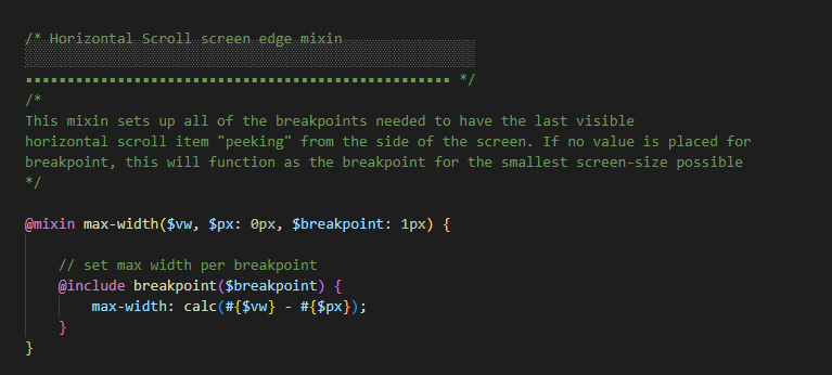
The series of max width mixins used in this example:
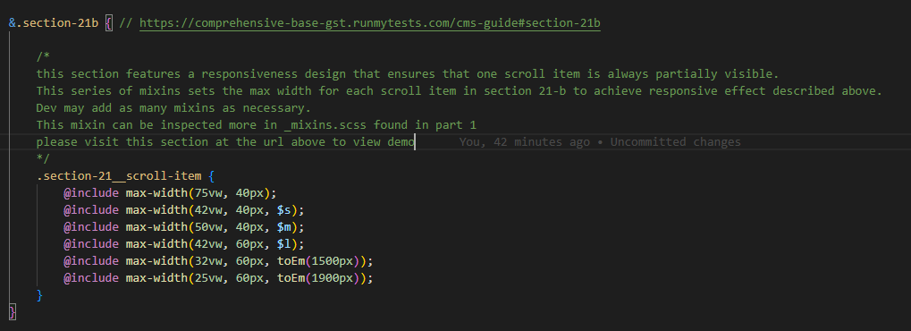
Note that some trial and error may be required by dev to get the values of the mixin correct.
Available Code Snippets:
- v3 - Section 21 - Top Copy: Use as a "reset" for any "Section 21 - Top Copy" module.
- v3 - Section 21 - Scroll Item: Use as a "reset" for any "Section 21 - Scroll Item [number]" module.
Scrollable Section Heading
Lorem ipsum dolor sit amet, consectetur adipiscing elit, sed do eiusmod tempor incididunt ut labore et dolore magna aliqua. Ut enim ad minim veniam, quis nostrud exercitation ullamco laboris nisi ut aliquip ex ea commodo consequat.
-
DO NOTE REMOVE THESE INSTRUCTIONS
Please use the Identifier field seen above to change aria label of this section.
Use a descriptive and unique name.
-----------------------------------------------------------------------------------
-

Lorem Ipsum Dolar
Lorem ipsum dolor sit amet, consectetur adipiscing elit, sed do eiusmod tempor incididunt ut labore.
-
Lorem Ipsum Dolar
Lorem ipsum dolor sit amet, consectetur adipiscing elit, sed do eiusmod tempor incididunt ut labore.
-
Lorem Ipsum Dolar
Lorem ipsum dolor sit amet, consectetur adipiscing elit, sed do eiusmod tempor incididunt ut labore.
-
Lorem Ipsum Dolar
Lorem ipsum dolor sit amet, consectetur adipiscing elit, sed do eiusmod tempor incididunt ut labore.
-
Lorem Ipsum Dolar
Lorem ipsum dolor sit amet, consectetur adipiscing elit, sed do eiusmod tempor incididunt ut labore.
-

Lorem Ipsum Dolar
Lorem ipsum dolor sit amet, consectetur adipiscing elit, sed do eiusmod tempor incididunt ut labore.
Intro Copy with Horizontal Scroller Tiles - (Section 21b)
Notes:
This section uses custom HTML modules. It can ONLY be done with custom HTML modules. Image size: 170x150
This section has been made so that a portion of a following slide is always visible from the starting position (even on very large screens), indicating that there is more content.
Desktop Video Example:
Mobile Video Example:
This effect is achieved by adding several max widths at several breakpoints, calculated with the following formula:
The series of max width mixins used in this example:
Note that some trial and error may be required by dev to get the values of the mixin correct.
Available Code Snippets:
- v3 - Section 21b - Header: Use as a "reset" for any "Section 21 - Top Copy" module.
- v3 - Section 21 - Scroll Item Sm: Use as a "reset" for any "Section 21 - Scroll Item [number] sm" module.
Scrollable Section Heading
-
DO NOTE REMOVE THESE INSTRUCTIONS
Please use the Identifier field seen above to change aria label of this section.
Use a descriptive and unique name.
-----------------------------------------------------------------------------------
-

Lorem Ipsum Dolar
Ut enim ad minim veniam, quis nostrud exercitation ullamco laboris nisi ut aliquip ex ea commodo consequat.
-
Lorem Ipsum Dolar
Ut enim ad minim veniam, quis nostrud exercitation ullamco laboris nisi ut aliquip ex ea commodo consequat.
-
Lorem Ipsum Dolar
Ut enim ad minim veniam, quis nostrud exercitation ullamco laboris nisi ut aliquip ex ea commodo consequat.
-
Lorem Ipsum Dolar
Ut enim ad minim veniam, quis nostrud exercitation ullamco laboris nisi ut aliquip ex ea commodo consequat.
-
Lorem Ipsum Dolar
Ut enim ad minim veniam, quis nostrud exercitation ullamco laboris nisi ut aliquip ex ea commodo consequat.
Larger Image Collage Media 2x3 Multi Item - (Section 47a)
Suggested Use: For displaying 5 "media" items (default media type: image). Collage layout requires specific image sizes for the appropriate module.
Required image sizes when selecting the Managed Asset in the Media Module:
- 843x406
- 768x768
- 405x227 Quantity 3


Multi Item - (Section 47b)
Suggested Use: For displaying 5 "media" items (default media type: image). Collage layout requires specific image sizes for the appropriate module.
Required image sizes when selecting the Managed Asset in the Media Module:
- 405x227 Quantity 3
- 843x406
- 768x768
Multi Item - (Section 47c)
Suggested Use: For displaying 5 "media" items (default media type: image). Collage layout requires specific image sizes for the appropriate module.
Required image sizes when selecting the Managed Asset in the Media Module:
- 768x1250 Quantity 2
- 768x597 Quantity 2


Multi Item - (Section 47d)
Suggested Use: For displaying 5 "media" items (default media type: image). Collage layout requires specific image sizes for the appropriate module.
Required image sizes when selecting the Managed Asset in the Media Module:
- 768x1250 Quantity 3
Multi Image Collage Media 2x3 - (Section 47e)
Suggested Use: For displaying 5 "media" items (default media type: image). Collage layout requires specific image sizes for the appropriate module.
Required image sizes when selecting the Managed Asset in the Media Module:
- 786x380
- 768x768
- 405x227 Quantity 3

Multi Item - (Section 47f)
Suggested Use: For displaying 5 images with caption/link. Collage layout requires specific image sizes for the appropriate module.
Required image sizes when selecting the Thumbnail Image in the Callout Action Link module:
- 843x406
- 768x768
- 405x227(3 images required)
SVG World Map - (Section 44a)

3 Column Multi Number and Copy - (Section 48a) Blue
Suggested Use: Up to 3 copy tiles
Available Code Snippets:
- v3 - Section 48 - Copy: Use as a "reset" for any "Section 48 - Copy [number]" module.
12
Stat Label Lorem Ipsum Dolor Sit
Ut enim ad minim veniam, quis nostrud exercitation ullamco laboris nisi ut aliquip ex ea commodo consequat.
12
Stat Label Lorem Ipsum Dolor Sit
Ut enim ad minim veniam, quis nostrud exercitation ullamco laboris nisi ut aliquip ex ea commodo consequat.
12
Stat Label Lorem Ipsum Dolor Sit
Ut enim ad minim veniam, quis nostrud exercitation ullamco laboris nisi ut aliquip ex ea commodo consequat.
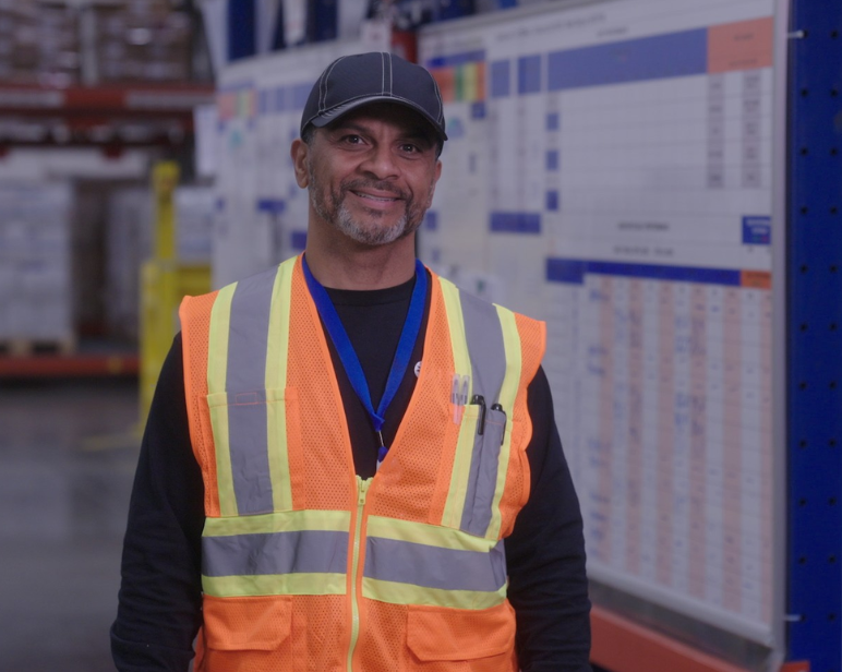
Headshot Testimonial with White Text on Blue - (Section 114a)
Suggested Use: Employee "headshot" photo and testimonial
Notes: The recommended image size for a "Section 14 - Image" module is 324x312 If an image asset does not match the recommended aspect ratio, it will appear as "cropped" to fit the expected dimensions. To avoid this, and to ensure optimal image quality and performance, make sure the image asset matches the recommended size before using it.
Available Code Snippets:
- v3 - Section 114 - Quote: Use as a "reset" for any "Section 114 - Quote" module.
- v3 - Section 114 - Caption: Use as a "reset" for any "Section 114 - Caption" module.

Nullam id vestibulum lectus. Curabitur commodo posuere sapien, non vulputate lorem dapibus vitae. Fusce est ligula, tincidunt eget cursus vel, faucibus eget sem. Nullam id vestibulum lectus. Curabitur commodo posuere sapien, non vulputate lorem dapibus vitae. Fusce est ligula, tincidunt eget cursus vel, faucibus eget sem.
First Name / Last Name
Title / Department
50-50 Quote Text Only - (Section 50a) Blue
Suggested Use: Copy and testimonial
Available Code Snippets:
- v3 - Section 50 - Copy: Use as a "reset" for any "Section 50 - Copy" module.
- v3 - Section 50 - Quote: Use as a "reset" for any "Section 50 - Quote" module.
Nullam id vestibulum lectus. Curabitur commodo posuere sapien, non vulputate lorem dapibus vitae. Fusce est ligula, tincidunt eget cursus vel, faucibus eget sem. Donec a mattis lectus. Praesent ac nulla iaculis, ornare magna quis, posuere ex. Quisque pulvinar feugiat sem in ultrices. Pellentesque ut volutpat nunc. Duis suscipit orci finibus libero bibendum, eget ornare mauris posuere. Curabitur sed lorem eu tortor convallis eleifend a eu ipsum. Morbi tempor, libero ac fringilla dignissim, ligbortis urna, commodo vehicula dolor libero.
Lorem ipsum dolor sit amet, consectetur adipiscing elit, sed do eiusmod exercitation ullamco tempor incididunt ut labore et dolore magna aliqua. Ut enim ad minim veniam, quis nostrud exercitation ullamco laboris nisi ut aliquip ex ea commodo consequat. Nullam id vestibulum lectus. Curabitur commodo posuere sapien, non vulputate lorem dapibus vitae. Fusce est ligula, tincidunt eget cursus vel, faucibus eget sem. Donec a ullamco laboris nisi ut.
Curabitur sed lorem eu tortor convallis eleifend a eu ipsum. Morbi tempor, libero ac fringilla dignissim, ligbortis urna lorem dolor.
1x4 Testimonial Scroller - (Section 45a)
Suggested Use: Scroller for displaying multiple testimonials with image and copy.
Notes:
This section uses custom HTML modules. It can ONLY be done with custom HTML modules. Image size 193x174.
Available Code Snippets:
- v3 - Section 45 - Scroll Item: Use as a "reset" for any "Section 45 - Scroll Item [number]" module.
-
DO NOTE REMOVE THESE INSTRUCTIONS
Please use the Identifier field seen above to change aria label of this section.
Use a descriptive and unique name.
-----------------------------------------------------------------------------------
-

Nullam id vestibulum lectus. Curabitur commodo posuere sapien, non vulputate lorem dapibus vitae. Fusce est ligula, tincidunt eget cursus vel, faucibus eget sem. Nullam id vestibulum lectus. Curabitur commodo posuere sapien, non vulputate lorem dapibus vitae. Fusce est ligula, tincidunt eget cursus vel, faucibus eget sem.
-
Nullam id vestibulum lectus. Curabitur commodo posuere sapien, non vulputate lorem dapibus vitae. Fusce est ligula, tincidunt eget cursus vel, faucibus eget sem.
-
Nullam id vestibulum lectus. Curabitur commodo posuere sapien, non vulputate lorem dapibus vitae. Fusce est ligula, tincidunt eget cursus vel, faucibus eget sem. Nullam id vestibulum lectus. Curabitur commodo posuere sapien, non vulputate lorem dapibus vitae. Fusce est ligula, tincidunt eget cursus vel, faucibus eget sem. Lorem ipsum dolor sit amet consecuitor eget.
-
Nullam id vestibulum lectus. Curabitur commodo posuere sapien, non vulputate lorem dapibus vitae. Fusce est ligula, tincidunt eget cursus vel, faucibus eget sem. Nullam id vestibulum lectus. Curabitur commodo posuere sapien, non vulputate lorem dapibus vitae. Fusce est ligula, tincidunt eget cursus vel, faucibus eget sem.
1x6 Testimonial Scroller - (Section 46a)
Suggested Use: Scroller for displaying multiple testimonials with image and copy.
Notes:
This section uses custom HTML modules. It can ONLY be done with custom HTML modules. Image size 94x94.
Available Code Snippets:
- v3 - Section 46 - Headline: Use as a "reset" for any "Section 45 - Headline" module.
- v3 - Section 46 - Scroll Item: Use as a "reset" for any "Section 45 - Scroll Item [number]" module.
Heading Lorem Ipsum
-
DO NOTE REMOVE THESE INSTRUCTIONS
Please use the Identifier field seen above to change aria label of this section.
Use a descriptive and unique name.
-----------------------------------------------------------------------------------
-

Nullam id vestibulum lectus. Curabitur commodo posuere sapien, non vulputate lorem dapibus vitae. Fusce est ligula, tincidunt eget cursus vel, faucibus eget sem. Nullam id vestibulum lectus. Curabitur commodo posuere sapien, non vulputate lorem dapibus vitae. Fusce est ligula, tincidunt eget cursus vel, faucibus eget sem.
-
Nullam id vestibulum lectus. Curabitur commodo posuere sapien, non vulputate lorem dapibus vitae. Fusce est ligula, tincidunt eget cursus vel, faucibus eget sem.
-
Nullam id vestibulum lectus. Curabitur commodo posuere sapien, non vulputate lorem dapibus vitae. Fusce est ligula, tincidunt eget cursus vel, faucibus eget sem. Nullam id vestibulum lectus. Curabitur commodo posuere sapien, non vulputate lorem dapibus vitae. Fusce est ligula, tincidunt eget cursus vel, faucibus eget sem. Lorem ipsum dolor sit amet consecuitor eget.
-
Nullam id vestibulum lectus. Curabitur commodo posuere sapien, non vulputate lorem dapibus vitae. Fusce est ligula, tincidunt eget cursus vel, faucibus eget sem. Nullam id vestibulum lectus. Curabitur commodo posuere sapien, non vulputate lorem dapibus vitae. Fusce est ligula, tincidunt eget cursus vel, faucibus eget sem.
Awards Slider - (Section 52a)
Celebrating Better Standards


Job List - (Section 5a)
Suggested Use: Non Interactive Job List Section
Looks like you haven't viewed any jobs yet,, search open opportunities now.
Looks like you haven't saved any jobs yet, search open opportunities now.
Note To Developer: Please include documentation for this section!
Heading Lorem Ipsum
Lorem ipsum dolor sit amet, consectetur adipiscing elit, sed do eiusmod tempor incididunt ut labore et dolore magna aliqua. Ut enim ad minim veniam, quis nostrud exercitation ullamco laboris nisi ut aliquip ex ea commodo consequat.
-
Nullam id vestibulum lectus. Curabitur commodo posuere sapien, non vulputate lorem dapibus vitae. Fusce est ligula, tincidunt eget cursus vel, faucibus eget sem. Donec a mattis lectus. Praesent ac nulla iaculis, ornare magna quis, posuere ex. Quisque pulvinar feugiat sem in ultrices.
-
Nullam id vestibulum lectus. Curabitur commodo posuere sapien, non vulputate lorem dapibus vitae. Fusce est ligula, tincidunt eget cursus vel, faucibus eget sem. Donec a mattis lectus. Praesent ac nulla iaculis, ornare magna quis, posuere ex. Quisque pulvinar feugiat sem in ultrices.
-
Nullam id vestibulum lectus. Curabitur commodo posuere sapien, non vulputate lorem dapibus vitae. Fusce est ligula, tincidunt eget cursus vel, faucibus eget sem. Donec a mattis lectus. Praesent ac nulla iaculis, ornare magna quis, posuere ex. Quisque pulvinar feugiat sem in ultrices.
-
Nullam id vestibulum lectus. Curabitur commodo posuere sapien, non vulputate lorem dapibus vitae. Fusce est ligula, tincidunt eget cursus vel, faucibus eget sem. Donec a mattis lectus. Praesent ac nulla iaculis, ornare magna quis, posuere ex. Quisque pulvinar feugiat sem in ultrices.
-
Nullam id vestibulum lectus. Curabitur commodo posuere sapien, non vulputate lorem dapibus vitae. Fusce est ligula, tincidunt eget cursus vel, faucibus eget sem. Donec a mattis lectus. Praesent ac nulla iaculis, ornare magna quis, posuere ex. Quisque pulvinar feugiat sem in ultrices.
FAQs - (Section 56b) Gray Section
Suggested Use: For displaying FAQ content. Each Section 56 - Content Module contains both the question and answer.
Notes: Same layout as 56a but with a grey background. When adding or resetting the question with the v3 - Section 56 - Content snippet, be sure to update the question id# in the Source Code.
Click on Source Code:
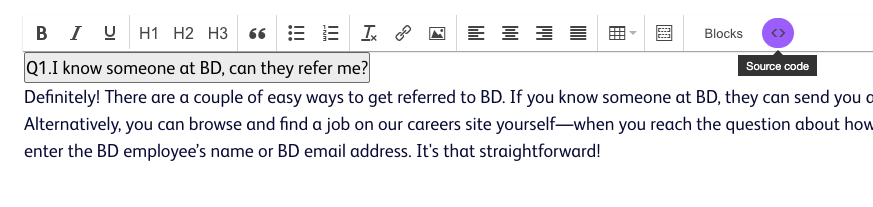
Update the id="default-1a" to reflect the actual question count.
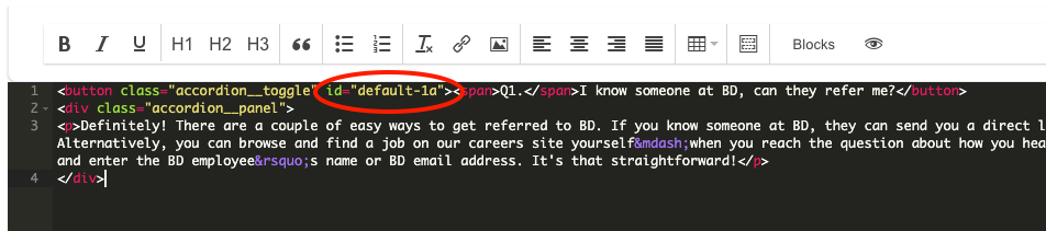
Example: There are currently 5 questions and you want to add a sixth.
Select v3 - Section 56 - Content snippet, and change the id value to id="default-6a".
Available Code Snippets:
- v3 - Section 56 - Intro: Use as a "reset" for any "Section 56 - Intro" module.
- v3 - Section 56 - Content: Use as a "reset" for any "Section 56 - Content [number]" module.
Heading Lorem Ipsum
Lorem ipsum dolor sit amet, consectetur adipiscing elit, sed do eiusmod tempor incididunt ut labore et dolore magna aliqua. Ut enim ad minim veniam, quis nostrud exercitation ullamco laboris nisi ut aliquip ex ea commodo consequat.
-
Nullam id vestibulum lectus. Curabitur commodo posuere sapien, non vulputate lorem dapibus vitae. Fusce est ligula, tincidunt eget cursus vel, faucibus eget sem. Donec a mattis lectus. Praesent ac nulla iaculis, ornare magna quis, posuere ex. Quisque pulvinar feugiat sem in ultrices.
-
Nullam id vestibulum lectus. Curabitur commodo posuere sapien, non vulputate lorem dapibus vitae. Fusce est ligula, tincidunt eget cursus vel, faucibus eget sem. Donec a mattis lectus. Praesent ac nulla iaculis, ornare magna quis, posuere ex. Quisque pulvinar feugiat sem in ultrices.
-
Nullam id vestibulum lectus. Curabitur commodo posuere sapien, non vulputate lorem dapibus vitae. Fusce est ligula, tincidunt eget cursus vel, faucibus eget sem. Donec a mattis lectus. Praesent ac nulla iaculis, ornare magna quis, posuere ex. Quisque pulvinar feugiat sem in ultrices.
-
Nullam id vestibulum lectus. Curabitur commodo posuere sapien, non vulputate lorem dapibus vitae. Fusce est ligula, tincidunt eget cursus vel, faucibus eget sem. Donec a mattis lectus. Praesent ac nulla iaculis, ornare magna quis, posuere ex. Quisque pulvinar feugiat sem in ultrices.
-
Nullam id vestibulum lectus. Curabitur commodo posuere sapien, non vulputate lorem dapibus vitae. Fusce est ligula, tincidunt eget cursus vel, faucibus eget sem. Donec a mattis lectus. Praesent ac nulla iaculis, ornare magna quis, posuere ex. Quisque pulvinar feugiat sem in ultrices.
Featured Job List - (Section 59a) Dynamic
Suggested Use: Short copy supported by a list of job links, with each link featuring job title and location.
Notes: The "Featured Jobs" job list module is configured to show the most recent jobs by default. It can also be configured to show related jobs based on job data present on the page where it is placed and/or in the job seeker's personalization cookie.
Available Code Snippets:
- v3 - Section 59 - Headline: Use as a "reset" for any "Section 59 - Headline" module.
- v3 - Section 59 - Copy: Use as a "reset" for any "Section 59 - Copy" module.
Heading
Duis metus purus, aliquam vel facilisis et, vehicula a diam. Donec tempor ante vitae elit semper et consequat sem tincidunt. Donec turpis urna, volutpat eget suscipit id, egestas fermentum arcu. Lorem ipsum dolor sit amet, consectetur adipiscing elit. Aenean sit amet turpis vitae turpis euismod facilisis in sed quam. Ut sed nunc ac nisi tristique facilisis. Fusce mauris mauris, consectetur ut tristique eu, fringilla ac ante. Nam sed tempus erat. Aliquam et velit nisi, et accumsan leo. Praesent mattis, lacus sed aliquam feugiat, sapien sapien semper nunc, non aliquet sem lectus ut tellus.
Featured Jobs
- Post Soniclean Operator - 3rd Shift Columbus, Nebraska
- Soniclean Operator - 2nd shift Columbus, Nebraska
- Grind Operator - 2nd Shift Columbus, Nebraska
CTA - Section 60a
Suggested Use: Large headline and link callout
Lorem ipsum dolor sit amet, consectetur adipiscing elit. Nullam vestibulum, tellus venenatis aliquet pretium, mauris magna sodales nisl, sed scelerisque nunc libero quis mi.
Tablist - Job Alert Form - (Section 51a)
Suggested Use: Talent Pool CTA and Job Alert form
Join Our Talent Pool
Sign up to get the latest company news, events, and future opportunities straight to your inbox.
Sign Up for Job Alerts
Create a job alert to be notified when positions that match your skills and location become available.